You are using an out of date browser. It may not display this or other websites correctly.
You should upgrade or use an alternative browser.
You should upgrade or use an alternative browser.
BAD Vogue Covers
- Thread starter Twiggy
- Start date
I thought we left glorification of “girlboss” feminism in 2016. Or are we back to glamourising war crimes because it’s now a “strong woman of colour” committing them?
#girlboss amirite?!?!
I am still not prepared for how insufferable DNC idpol liberals are going to be
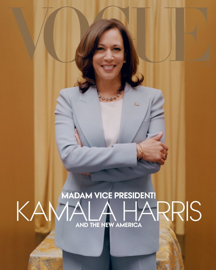
on top of everything awful that kamala represents this cover is such a mess.
the ill-fitting power suit, the man hands, the awkward set design, the "i just shat my pants" facial expression and corresponding color scheme, the CONVERSE ............. get it together, vogue.
And the weird tacky "gushing" (and weirdly "tucked in"? lmao) pink background for the radical "madam" VP manages to fall below my already rock bottom expectations. At this point I am beyond hoping for American Vogue to get it together thoughon top of everything awful that kamala represents this cover is such a mess.
the ill-fitting power suit, the man hands, the awkward set design, the "i just shat my pants" facial expression and corresponding color scheme, the CONVERSE ............. get it together, vogue.

Kamala's team says the cover was supposed to be the suited pic, but that one, between the near-satirical naïveté of the pose and the didn't-even-try cover lines, is.... barely better?


I'm not gonna bash a 16y/o, especially since she seems unproblematic and sweet... All I'm gonna say is that we don't need another average nepo model with chipmunk cheeks strutting around. This is literally her 2nd modeling job ever (?) and it's for Vogue. She should come back in a few years when she's grown into her looks and herself as a person or better yet not come back at all. I'm just so sick and tired of seeing the same bloated, baby faces around over and over again.
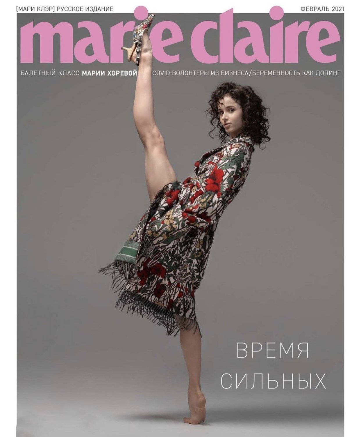
Not Vogue, but god they did poor Maria dirty on this Marie Claire cover. They had the opportunity to do a beautiful shoot in ethereal clothes with a professional ballerina, and yet they chose this (very questionable imo) outfit and hairstyle. The pose and background are so boring too 

Eye rolling at so many people acting like this Walmart Marilyn Monroe Vogue cover is absolutely groundbreaking, when really the only reason it's getting so much attention is because people are going mad over being able to properly see Billie Eilish's unimpressive body for the first time. Don't know what all the obsession is about.


Her body has terrible proportions. I mean, she is 19 and already overweight... when I was 19 I could eat a lot more then I do now at 25, your metabolism is just not the same after your twenties.Eye rolling at so many people acting like this Walmart Marilyn Monroe Vogue cover is absolutely groundbreaking, when really the only reason it's getting so much attention is because people are going mad over being able to properly see Billie Eilish's unimpressive body for the first time. Don't know what all the obsession is about.

How is she going to look at 30?

She's not overweight, she's thicc!!1! xxI mean, she is 19 and already overweight...

Don't know what all the obsession is about.
Isn't it obvious in the age of body-positivity - which welcomes anyone chubby that seeks validation by cheaply just revealing their flabby cellulite, thunder thighs, stretch marks & co. on social media?

While I agree with your opinions on her very unimpressive body... to me this cover is just amazing. I love the aesthetics of it, the color palette, the placement of the text, the styling... I find it so incredibly chic and elegant. It’s so good to see Billie in something feminine and sexy. I can’t stand her oversized jumpers and cargos and her unexplainable love for bright colors. It’s the first time I see a woman rather than a brat.Eye rolling at so many people acting like this Walmart Marilyn Monroe Vogue cover is absolutely groundbreaking, when really the only reason it's getting so much attention is because people are going mad over being able to properly see Billie Eilish's unimpressive body for the first time. Don't know what all the obsession is about.

The whole shoot is a masterpiece IMO.
While I agree with your opinions on her very unimpressive body... to me this cover is just amazing. I love the aesthetics of it, the color palette, the placement of the text, the styling... I find it so incredibly chic and elegant. It’s so good to see Billie in something feminine and sexy. I can’t stand her oversized jumpers and cargos and her unexplainable love for bright colors. It’s the first time I see a woman rather than a brat.
The whole shoot is a masterpiece IMO.
All it looks to me is just a cheap Marilyn Monroe knockoff with some latex thrown in there to modernise it (aka worsen it further). To be honest, I'm not bothered about how she usually dresses, still think it's a bad looking cover irrespective of if it's her usual style or not. Maybe on a HF model it'd work, but instead we got an Ann Summers ad.
While I agree with your opinions on her very unimpressive body... to me this cover is just amazing. I love the aesthetics of it, the color palette, the placement of the text, the styling... I find it so incredibly chic and elegant. It’s so good to see Billie in something feminine and sexy. I can’t stand her oversized jumpers and cargos and her unexplainable love for bright colors. It’s the first time I see a woman rather than a brat.
The whole shoot is a masterpiece IMO.
I mean I like the vibe of the shoot and I actually like the cover and the colors but I just don’t think she fits in this.
I’ll take the Billie Eilish cover over these
I’ll see your Jill Kortleve submission and raise you: Kendall Jenner for Vogue Hong Kong May 2021
The irony of "The Art of Fashion: Kendall Jenner"...I’ll see your Jill Kortleve submission and raise you: Kendall Jenner for Vogue Hong Kong May 2021
View attachment 101836View attachment 101837View attachment 101838


